
Neutral Grays and Blacks in Your Paintbox
Watercolor practice based upon February 2024 demonstration by Kumie Kim
In February 2024, RTBA member Kumie Kim did a demonstration of Neutrals and Grays. Recently, while flipping through my sketchbook, I came across the handout given at that demonstration. A handy and timely discovery, since I am working through various methods of making neutral colors, especially light grays and dark blacks, which seem to be so much harder for me to create than the brown, tan, and beige neutral colors.
Formulas
The demonstration handout listed five formulas that mixed three primary colors or two complementary colors. (Burnt Sienna being a shade of orange.)
Perm Rose + UM Blue + Lemon Yellow
UM Blue + Burnt Sienna
Cobalt BL + Quin. Burnt Orange
Perm Rose + Meridian Green
Perm Rose + WN Green
Pigment Names to Pigment Numbers
Looking through my paintbox, surprisingly, I had many of the colors. I took out the colors that matched the recommended colors in the mixing formulas listed on the handout: Permanent Rose (PV19 - WN), Ultramarine Blue (PB29 - MG & WN,), Lemon Yellow (PY175 - DS), Burnt Sienna (PBr7 - MG & PR101 - WN), Cobalt Blue (PB28 - DS & MG), and Quinacridone Burnt Orange (PO48 - DS). Some colors I had in more than one brand. Differences can be seen in the Burnt Sienna where different companies use the same name for different pigments.
These colors may or may not be the same brand as used in the demonstration; however, I could see what I could do with colors in my paintbox.
Viridian Green and Winsor Green were not in my paintbox. M.Graham, Schminke, and Daniel Smith make Viridian from PG 18, which is the traditional Virdian pigment. Sennelier and Winsor Newton (called Viridian Hue) have a Viridian made from PG7 - Phthalo Green. Holbein has both Viridian (PG18) and Viridian Hue (PG7).
Winsor Green comes in yellow shade and blue shade. Yellow shade is made from PG36 - Phthalo Green, while blue shade is made from PG7 - Phthalo Green.
Phthlo Green (PG7 - MG) was in my paintbox. It has the similar characteristics to Viridian — a bright green with bluish tints.
Testing
I. Perm Rose + UM Blue + Lemon Yellow
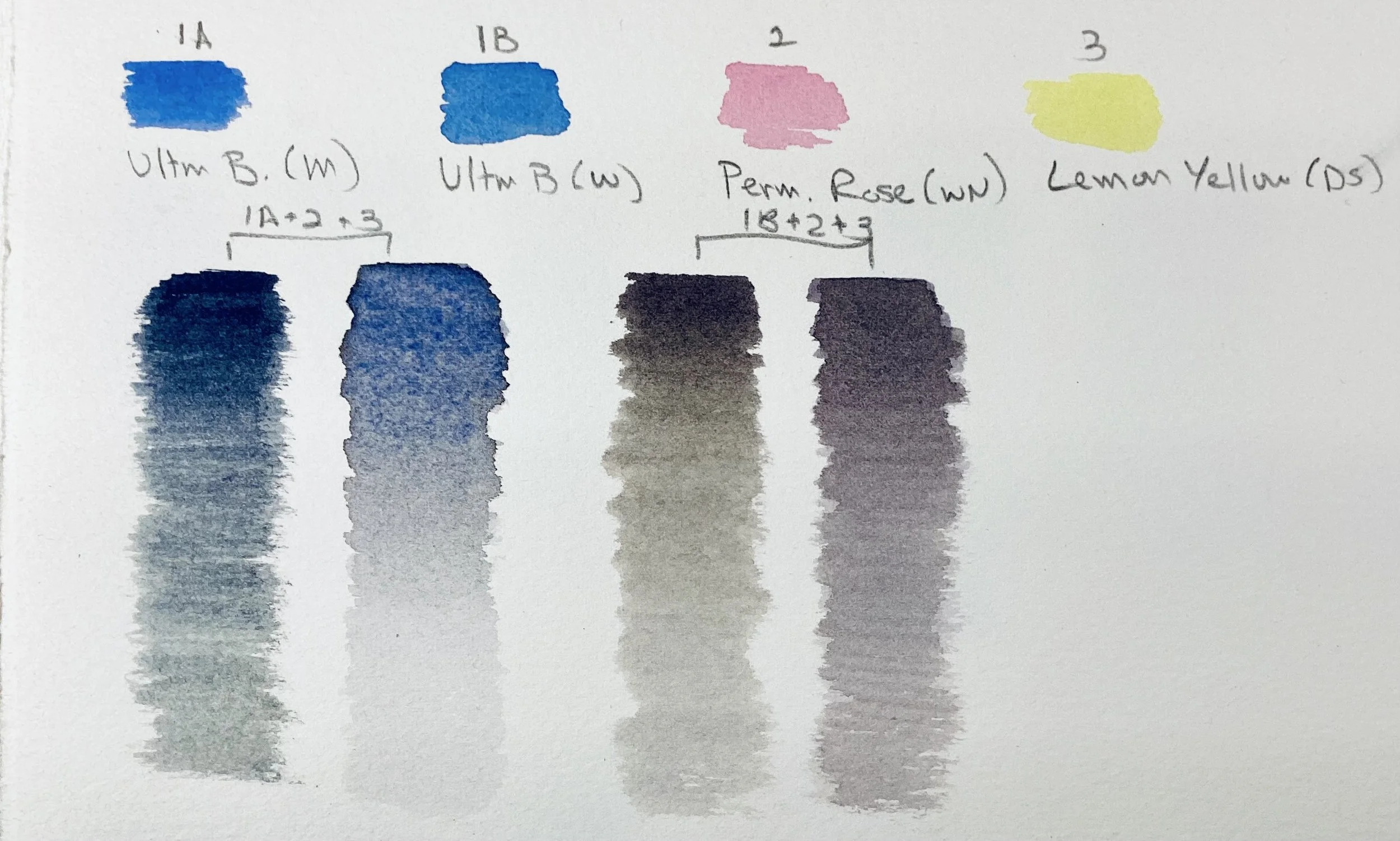
Mixing Primary Colors
Making gray/blacks from three primary color has always been a challenge. Trying several times, I could not achieve a black without a blue, or red, or green, or brown bias. Wet, it appeared to be a dark black, but dry, the dominant color revealed itself. I was satisfied with some of the grays that came about in the diluted mixes.
In addition, each time I tried to repeat the formula, it came out different. I felt that if I were working on a painting and needed more of the same black or gray, I would not be able to achieve a similar color.
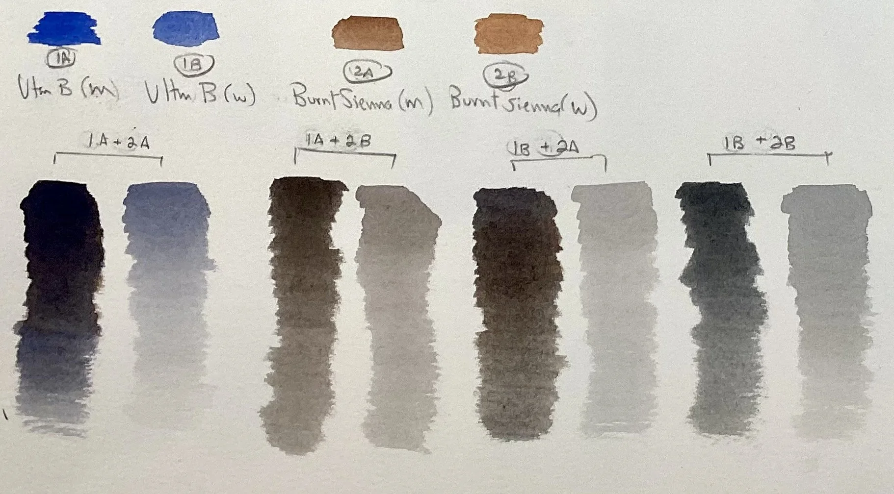
Ultramarine Blues and Burnt Siennas
II. UM Blue + Burnt Sienna
Working with Burnt Sienna was less of a challenger. Sometimes, the mix still had a hint of brown or blue, but this formula quickly achieved a black. In addition, it was easy to quickly repeat the mix. Here, the brand made little difference in results. Although both Ultramarine Blue brands were PG29, M.Graham was a richer consistency and could easily dominate the mix. The M.Graham Burnt Sienna (PBr7), made from brown pigment, could make brown bias. The Winsor Newton Burnt Sienna (PR101), made from a red pigment, could make a red bias. With practice, it would make no difference.
Cobalt Blues and Quinacridone Burnt Orange
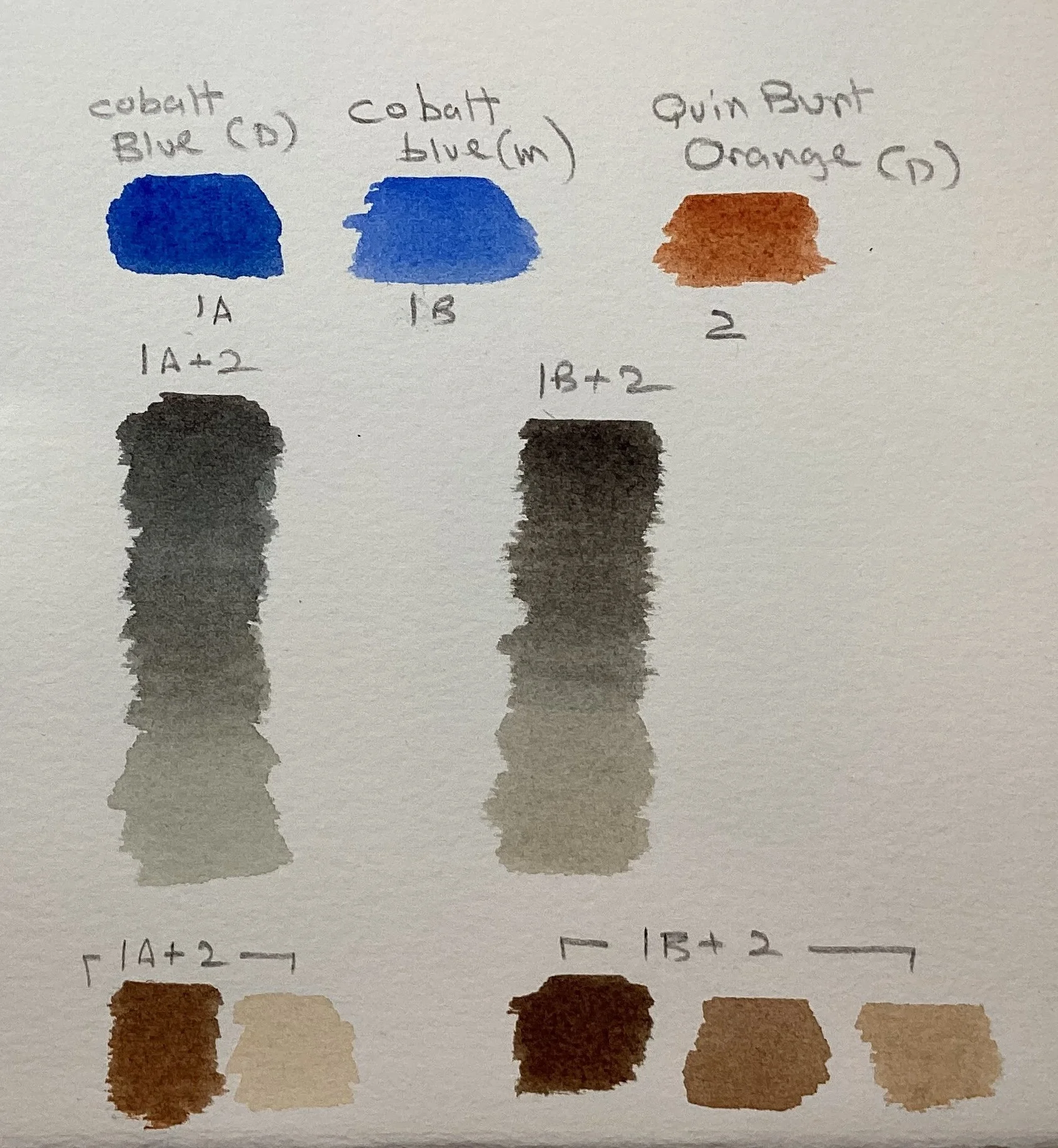
III. Cobalt BL + Quin. Burnt Orange
Although these colors were in my paintbox, I never put them together. I had my doubts that a black could be achieved using a lighter blue like cobalt. These blacks were easily achieved and could be repeated with equal results. I also felt the browns and tans created were rich and vibrant. Both brands of Cobalt Blue were made of PB28, but the Daniel Smith seems to be a stronger color. This made no difference.
Phthalo Blue and Permanent Rose
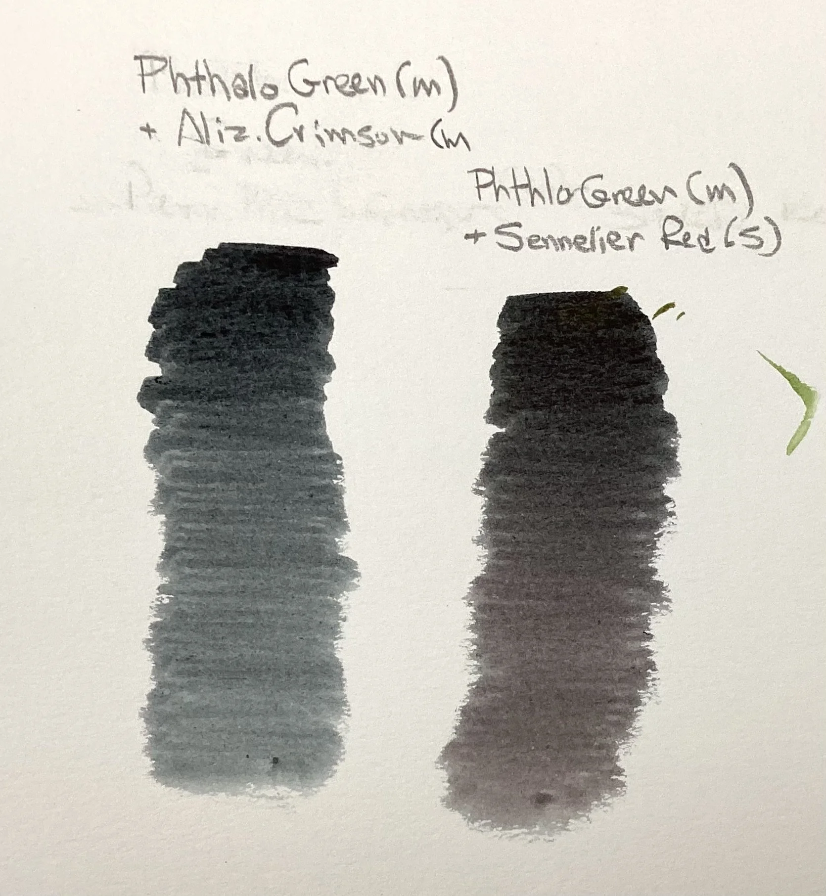
Phthalo Green and Alizarin Crimson or Sennelier Red
IV. Perm Rose + Viridian Green
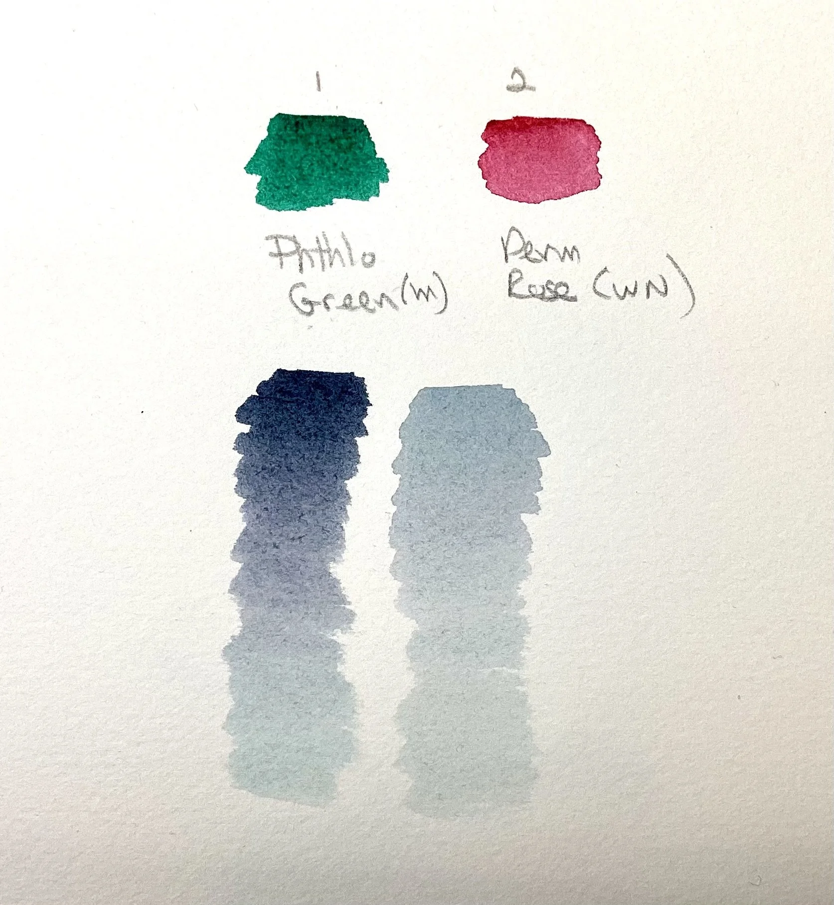
V. Perm Rose + WN Green
This was my experiment with Phthlo Green (PG7 - MG). This was a challenge. This was a mix that appeared black but dried blue. Permanent Rose (PV19 — WN) is made of a violet pigment and is easily overcome by Phthalo Green.
Phthlo Green needs a more neutral red that is equally in strength. My M.Graham Permanent Alizarin Crimson (Pr264) achieved a neutral black right away.
Sennelier Red (Pr284) achieved a deep black right away but the red bias became apparent when diluted.
In summary, an hour of working through these formulas was an excellent introduction to the variety of grays and black that can be achieved. It is easy to see what neutral colors are already in my paintbox. With time, perhaps the three primary color formula will become second nature. For, as Kumie Kim stated in her introduction: “The reason to make your own gray is to harmonize with the colors in your painting.”