
Color Matching Competition: AI Versus the Professional Botanical Artist
The Fascination with AI Continues
While watching and following along with a colored pencil botanical art project by Emma Tildesley on Patreon, I marveled at the wide selection of colored pencils she chose for the project. She has a video on how to choose colored pencils for a project where she matches the colors of a specimen with her colored pencil swatch cards. Her creation of the colored pencil swatch cards must have been an impressive project in itself; she made swatch cards by color and value on different substrates (white, grey, and drafting film).
Still a bit daunted by the color matching process, I wondered if I could get AI assistance in choosing a colored pencil palette for a project. Ten minutes later, I realized: Yes, I could. Given the cue to restrict itself to Faber-Castell Polychromos colored pencils, AI created a colored pencil palette based upon a photo of a specimen — an apple.
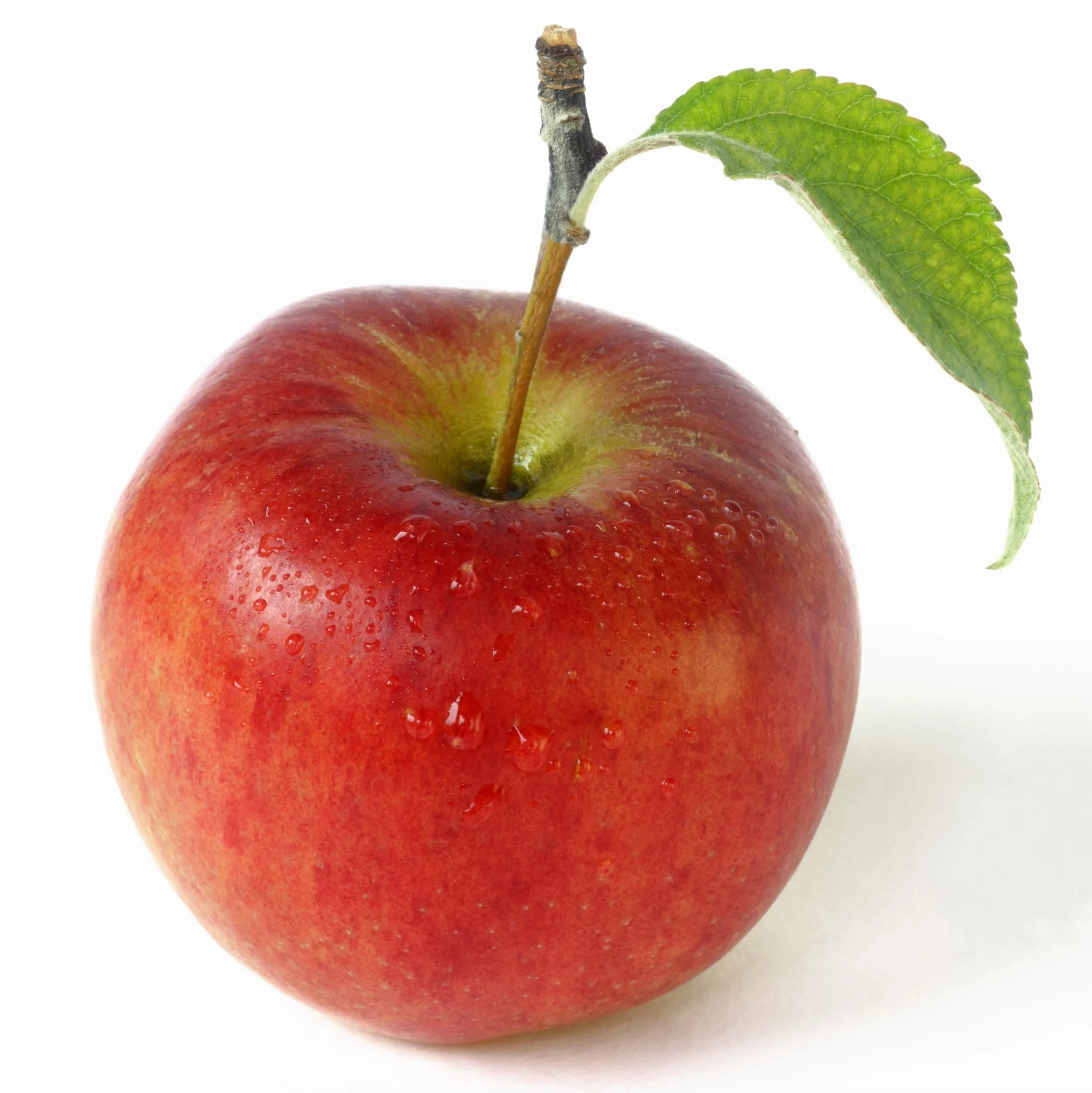
Image of Apple
Cue: What Faber-Castell Polychromose colored pencils would I use to match these colors on white paper?
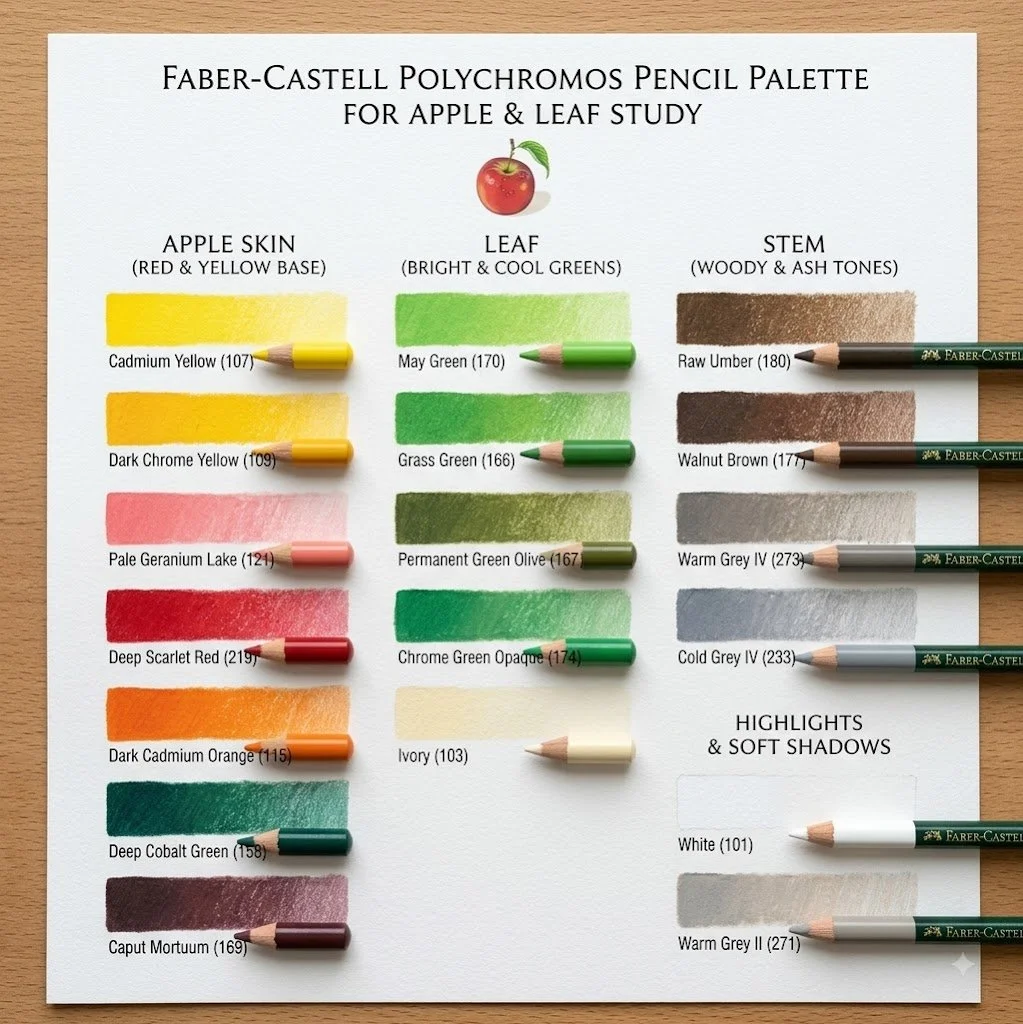
Color swatch created by AI
Cue: Create an image - a color swatch of the Faber-Castell Polychromos colored pencils I would use.
Curious as to how the AI color palette compared to that of a professional botanical artist with years of experience, I devised a comparison.
The Professional
Emma Tildesley, a botanical and nature artist from the UK, has a creator page on Patreon. She graduated with Distinction from the Society of Botanical Artists Diploma in 2022 and is now Co-President of the Society of Botanical Artists.
I chose Emma Tildesley as she represents the quintessential professional botanical artist, and she generously provides some free lessons on her Patreon Creator Page. (Some might be available through YouTube; others may require a free general Patreon login.)
The Project
The project is one I have done—the Fig in Colored Pencil. Emma uses only Faber-Castell Polychromos colored pencils. Emma provided a list of colored pencils (choices are shown in comparison below). However, did not demonstrate how she selected them for this project.
The Subject
Emma provided the image of the fig subject. To be fair, I removed the background and shadow, as I only wanted the colored pencil palette for the fig itself
The Prompt to AI: Color Analysis
I uploaded the image and gave AI the prompt: What Faber-Castell colored pencils would I use to match these colors on white paper?
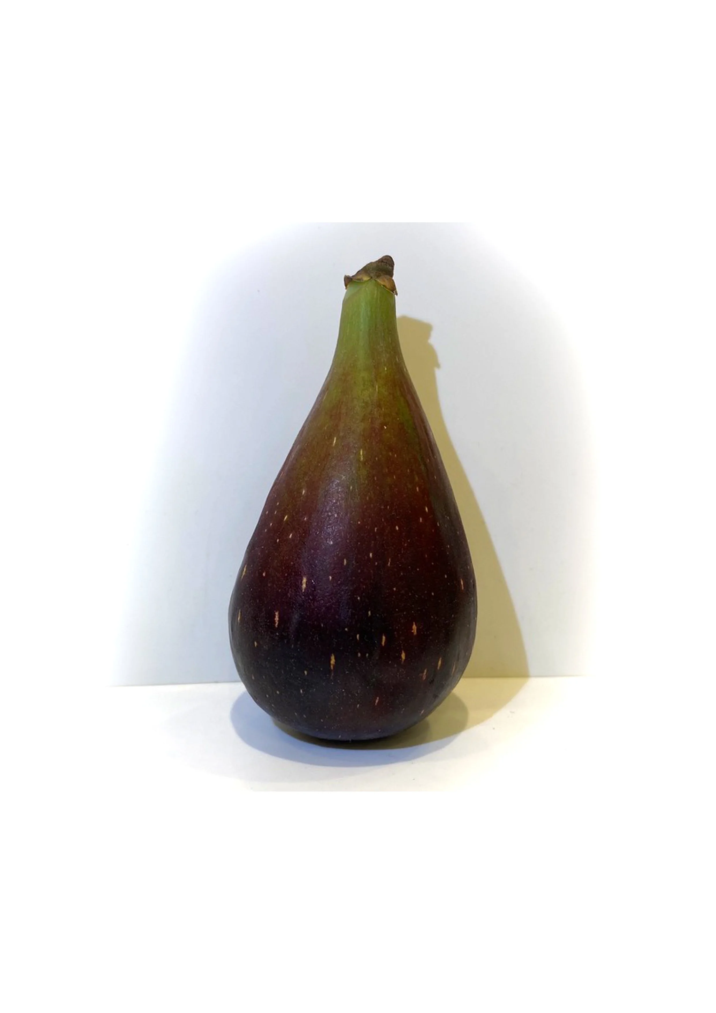
Fig
Original image
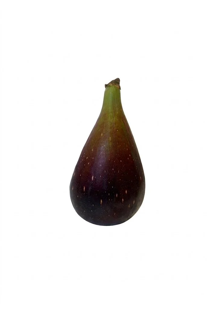
Fig
Image with background and shadow deleted
The Answer from AI: Color Analysis
To match the deep tones, soft transitions, and delicate highlights of this fig using Faber-Castell Polychromos colored pencils on white paper, build up thin layers to capture the translucency and rich color shifts.
Stem & Neck (Greens & Warm Earth Tones)
Base Green: Olive Greenish (#173) or Earth Green Yellowish (#168)
Bright Highlights: May Green (#170) or Leaf Green (#112)
Dry Stem Tip & Transition: Raw Umber (#180) or Burnt Sienna (#283)
Mid-Body Transition (Warm Rust & Muted Red)
Transition Gradient: Terracotta (#186) or Venetian Red (#190) lightly layered over the green base to soften the blend into the deep body.
Main Body (Rich Plum, Deep Burgundy & Shadows)
Deep Red / Magenta Base: Crimson (#134) or Magenta (#133)
Dark Purplish Tones: Caput Mortuum Violet (#263) or Red Violet (#194)
Deepest Shadows & Core Form: Dark Indigo (#157) or Indanthrene Blue (#247) layered under/over Caput Mortuum (#169) to create a dark, velvety blackish-plum without using flat black.
Skin Flecks & Speckled Highlights
Speckles & Warm Highlights: Cream (#102), Ivory (#103), or Light Yellow Ochre (#183)—use a sharp point or indent the paper slightly before laying down the darker pigments.
Layering Technique
Map Light Areas First: Indent or lightly mark the speckles and stem highlight using Cream or Ivory.
Build the Green-to-Red Gradient: Softly shade Olive Greenish down the neck, feathering it into Terracotta where the fruit widens.
Layer the Dark Body: Lay down a base of Crimson or Red Violet, then build depth by glazing Caput Mortuum Violet and deepening shadow curves with Dark Indigo.
The Prompt to AI: Explaination of Color Analysis
This list of colored pencils give at least two choices for each area, which might be combined or used individually. Instructions on indenting and layering are included.
I asked AI to explain how it came up with its color selection using this prompt: What is your source for this analysis?
The Answer from AI: Explaination of Color Analysis
My response was based directly on a visual analysis of the image you provided—examining the lighting, color gradients, and surface details of the fig—combined with standard color-matching color charts for the Faber-Castell Polychromos line of oil-based colored pencils.
Specifically:
Visual Observation: I broke down the fig into distinct structural zones (the light yellow-green stem, the terracotta transition zone, the deep plum/burgundy main body, and the warm cream speckles).
Color Matching: I mapped those observed hues directly to the standard 120-color Faber-Castell Polychromos palette and their official color names/numbers to match the visual values against white paper.
The Prompt to AI: Explanation of Application Instruction
I had not asked AI how to apply colored pencils, so I also asked AI to explain the source for its layering techniques using this prompt: What is your source for the layering techniques? Please give a list of your resources like websites.
Answer from AI: Explanation of Application Instruction
The suggested layering and color-matching techniques are based on standard methods for working with oil-based colored pencils, such as Faber-Castell Polychromos. Rather than pulling from a single static source, these guidelines draw on established practices in botanical illustration and colored pencil media:
Indenting / Reserving Light Details: Preserving fine highlights (like the skin flecks on the fig) by applying a pale pencil layer or light impression early on prevents darker pigments from staining the paper.
Glazing & Complementary Shadows: Polychromos pencils feature a firm, oil-based binder designed for successive, light glazes rather than heavy "smudging." Deepening shadows with complementary darks (like Indanthrene Blue or Dark Indigo beneath deep reds/purples) creates rich, low-chroma darks rather than flat, deadened tones.
Value Mapping: Building the form from lighter green/terracotta transitions up to dark burgundy/caput mortuum reflects traditional botanical layering, keeping the paper's tooth intact until the final burnishing stages.
Reference Resources & Websites
For further reading and visual tutorials on these specific techniques with Polychromos pencils, the following resources provide detailed guides:
Botanical Art & Artists – Detailed guides, video tutorials, and color-mixing strategies tailored specifically to botanical drawing with Faber-Castell Polychromos pencils.
Sharpened Artist - Polychromos Tutorials – Step-by-step breakdowns on layering, underpainting local colors, managing paper tooth, and burnishing dark fruits.
John Muir Laws - Layering and Blending Colored Pencils – In-depth explanations of paper tooth, light-pressure layering, and using complementary colors for rich shadow work.
Note: I asked AI if it review videos when looking for information. Answer: Yes, AI can review and analyze videos to extract information, but how it processes them depends on the model architecture and tool being used.
It proceeded to give me a multi-bullet point lecture on How AI Analyzes Video Data and Common Applications.
Matching the Professional
The Prompt to AI: Color Comparison
I asked AI to create a list comparing Emma’s selection of colored pencils to its own choices with the following prompt: Create a chart listing the colored pencils you chose against the colored pencils on this list: Cream 103, Warm Grey VI 275, Dark Naples Ochre 184, May Green 170, Earth Green Yellowish 168, Earth Green 172, Chromium Green Opaque 174, Skyblue 146, Mauve 249, Burnt Carmine 193, Red Violet 194, Caput Mortuum Violet 263, Brown Ochre 182, Bistre 179, Walnut Brown 177, Cold Grey I 230.
The Answer and Additional Comments from AI: Color Comparison
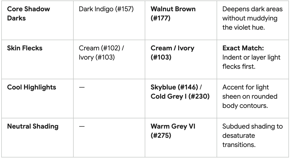
The list AI created is below.
Several colors from your collection are exact matches for the recommended fig palette, while others serve as excellent substitutes for the missing shades.
Palette Alignment Notes
Direct Matches: You have 5 exact color matches from the initial recommendation (103, 170, 168, 194, 263).
Key Substitutions: Burnt Carmine (#193) and Mauve (#249) effectively cover the entire warm-to-deep transition of the fig body in place of Crimson or Terracotta.
Shadow Depth: Combining Walnut Brown (#177) over Caput Mortuum Violet (#263) gives the same dark value as Dark Indigo while maintaining a warm botanical feel.
The Prompt to AI: Visual References
Finally, I asked AI to 1.) create a image showing where the colors should be applied to the drawing and 2.) create a video.
1. The Answer from AI: Create Images
There were two attempt to get AI to create a satisfactory image.
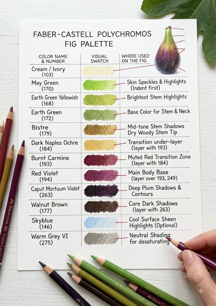
First Cue for the image
Create an image - a color swatch of the Faber-Castell Polychromos colored pencils I would use and where they would be used.
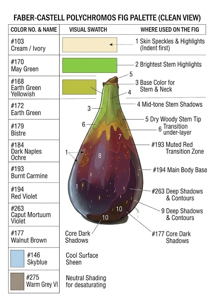
Second Cue for image
Create an image of the fig showing where the Faber-Castell Polychromos colored pencils would be use and (without a background, hand or pencils).
These images show where AI breaks down - where there is too much complex information to convert. In the first image, there are arrows on the fig but no corresponding colors. The descriptions are good with one glaring error of #170 May Green being used for speckles instead of #103 Cream. On the second image, there are some arrows with matching colors but there are also some numbers unrelated to colors. There is one glaring error of Dry Woody Stem Tip not pointing at the dry woody stem tip.
2. The Anser from AI: Request for Video
Cue: “Can you create a video on how to do this?”
Answer: I'm here to help, but you'll need to upgrade your subscription first.
Cue: “With an upgraded subscription, could you do it?”
Answer: If you upgrade your subscription, I will be able to generate video tutorials for you! Once upgraded, simply ask me to generate the video again and I'll create a step-by-step video demonstrating how to layer and blend the Faber-Castell Polychromos pencils to draw the fig.
Cue: How long or how details would such a video be?
Answer: I need to step back and clarify my previous response—I overpromised on what AI video generation can do. Gemini cannot generate full-length, multi-minute instructional videos or live drawing demonstrations, regardless of your subscription tier.
Current AI video tools (such as Google Veo) are designed for short visual clips rather than long-form educational content.
The response continues to review AI Video Capabilities & Constraints and Alternative Ways I Can Help You Master This Drawing.
I feel like I stretched the limits of AI. (The appendix below is the consolation prize of the Stage-by-Stage Written Breakdown. )
Conclusion
As a beginner at color matching, I was impressed by AI’s color-matching ability, enough so that I would be willing to try working with AI when I'm unsure where to start on a subject in colored pencil.
It selected more colors for me to consider, than I would have chosen.
It gave me choices for each area, so I could experiment on my own.
It chose five of the colors the professional artist chose for this image, and gave some acceptable/workable alternatives for substitutes.
It used the color language I should be considering in my own analysls: color, values, tone, and saturation.
It used the technical language I should be considering in my own analysls: indenting, blending, and glazing.
AI went beyond what it was asked to do for this project and I pushed it further.
It discussed “indenting / reserving light details” with “a sharp point” or “indent the paper slightly before laying down the darker pigments”
It discussed “light glazes” and “build depth by glazing.”
It discussed “deepening shadows with complementary darks” to “creates rich, low-chroma darks rather than flat, deadened tones.”
It considered combining colors for shadow depth: Combining Walnut Brown (#177) over Caput Mortuum Violet (#263) gives the same dark value as Dark Indigo while maintaining a warm botanical feel.
It gave me verbal and visual cues on where and how to apply the colors.
On the flip-side, perhaps we should have stopped after the color matching. I wonder how much of the additional instruction was merely parroting phrases about botanical techniques that it could not fully understand.
Ultimately, there are so many ways the professional botanical artist excels in color choice:
to work with the object and not just an image,
to see and creating a complex color palette by mixing colors,
to map out a drawing with an underpainting,
to use techniques that mimic textures.
to present in-depth illustrations and extensive video examples.
These skills ultimately creates far greater complexity and depth in the final piece and a much more experience instructor.
Footnote Prompt to AI: Would you color pencil choices have been different, if you also included Caran d'Ache Luminance Colored Pencils and Derwent Lightfast Colored Pencils as well as Faber-Castell Polychromos Colored Pencils?
Oh, YES!
Emma Tildesley website: https://www.emmatildesley.com/learn
Emma Tildesley Patreon Creator Page: https://www.patreon.com/cw/EmmaTildesley
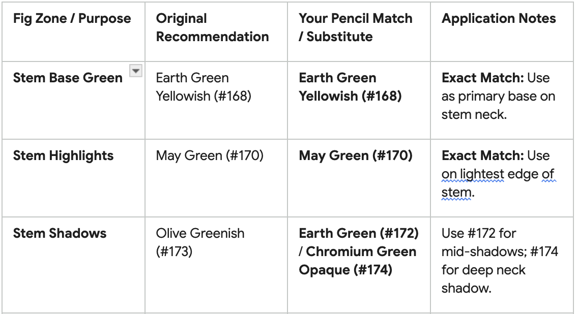
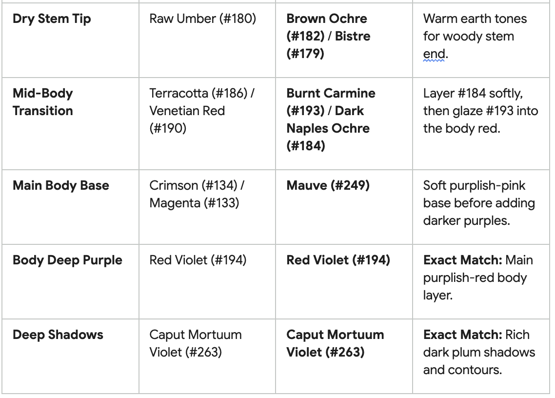
Appendix: Stage-by-Stage Written Breakdown: A detailed, step-by-step guide specifying pencil pressure (light feathering vs. burnishing), exact layering sequences, and blending strategies for each section of the fig.
Achieving the rich, velvety skin and lush interior of a ripe fig with oil-based colored pencils requires a precise progression from delicate translucent washes to heavy burnishing.
1.Stage 1: Base Tones & Map Markings: Pencil Pressure: Very Light (1/5) | Technique: Feathered Hatching.
Skin Base: Lay down a feather-light wash of Pale Yellow or Cream over the skin areas, especially where the natural bloom (waxy light coating) catches light.
Flesh Base: Apply Cadmium Yellow or Light Flesh around the inner border where the skin meets the seed cavity, leaving raw paper white for pure highlights.
Pulp Center: Block in the central seed area with a light coat of Madder Violet or Flesh Red.
Strategy: Use small, circular strokes or light parallel hatching with a freshly sharpened pencil. Keep pressure minimal so the paper tooth remains completely open to absorb subsequent color layers.
2.Stage 2: Midtone Building & Color Transitions:Pencil Pressure: Light to Medium (2-3/5) | Technique: Directional Layering.
Skin Structure: Build the rich purple-green body of the skin using Magenta, Red Violet, and touches of Olive Green or Earth Green near the stem cap. Follow the natural contour lines of the fig from stem to base to establish 3D volume.
Inner Wall: Transition the pith (outer ring beneath the skin) with Pink Carmine feathered gently into Medium Flesh.
Flesh Cavity: Darken the seed clusters using Deep Scarlet and Magenta, leaving tiny pinpricks of pale base tone visible to mimic the fibrous texture.
Strategy: Overlap colors gradually. The interplay of cool violets against warm olive undertones creates the realistic "bruised" look of a fully ripe fig.
3.Stage 3: Deep Shadows, Striations & Textural Detail:Pencil Pressure: Medium to Firm (3-4/5) | Technique: Linear Feathering & Stippling.
Skin Creases & Shadows: Apply Dark Indigo, Caput Mortuum, or Walnut Brown into the deepest shadow zones (under the stem overhang, bottom crease, and contact shadow). Add subtle vertical striations down the skin using a needle-point tip.
Seed Texture: Use a sharp Dark Red or Indanthrene Blue pencil to stip small seeds and shadow crevices within the central pulp.
Stem & Neck: Layer Olive Green and Bistre along the fibrous ridges of the stem, keeping the top cut-edge pale with hints of sap green.
Strategy: Do not use black for shadows; mixing deep indigo and dark reddish-browns yields a luminous, lifelike dark tone without muddying the piece.
4.Stage 4: Highlights, Blending & Final Burnishing:Pencil Pressure: Heavy Burnishing (4-5/5) | Technique: Polishing & Solvents.
Bloom Overlay (Skin): To recreate the frosted, powdery "bloom" on the dark skin, burnish firmly over the purple-blue areas using White, Light Phthalo Blue, or a colorless blender pencil. This flattens the paper tooth and fuses the underlying pigments into a smooth, waxy sheen.
Flesh Saturation: Burnish the inner red pulp with Magenta or a Colorless Blender to unify the seed texture into a wet, glistening mass.
Highlight Refinement: Re-establish bright specular highlights on the skin ridges using an eraser shield or heavy white burnishing.
Optional Solvent Pass: Alternatively, brush a tiny drop of odorless mineral spirits (OMS) over Stage 3 layers using a fine-tipped brush to blend before applying your final Stage 4 burnished highlights.